


I moved to Dallas in 1986 to take a job at the University of Texas at Dallas (actually located in Richardson, north of the city). The landscape of that grim metropolitan environment, suffering from a post-boom downturn in the economy, seemed resistant to description in any familiar mode of literary form. The notion of a bookscape came to mind as a way of describing and detailing the confusing disorientation induced by the empty artifice of the place. This initial publication of the text was brought about by invitation from Peter Ganick. But the larger project involved creation of a large, unique book object, a hand-made box, covered in gold, with small silver boxes inside, each of which was an object with text. The box contained two layers of book objects in their boxes, and was meant to have the look of a Neiman Marcus or other expensive, luxury store package. The book objects were all made with found materials, with texts and lettering produced in a wide variety of ways -- using straight pins, broken glass, hand lettering, press type, typewriter, etc. Each object had an archetectonic form, suggestive of the buildings populating the Dallas landscape. They could be set up on a table top to create a "bookscape." Conception of that project took place as a response to the question: "What is a literary form appropriate to these times?" The book object was finished only in the summer of 1988, a long hot May and June, while the streets outside my apartment were being repaved with steaming asphalt, and I sat in front of a television and worked days on end to finish production before packing the book box and leaving Dallas. The book box was bought by the Getty after I had an exhibition at Granary Books.
This sad looking little pamphlet was produced using the dot matrix printer I had for my first, IBM-clone computer. The typography makes the best use I could of three variations in font -- a condensed, an expanded, and a standard width. The layout was done by creating the print-outs and then pasting them up on sheets of paper taped to the windows with a grid of graph paper underneath. Primitive.
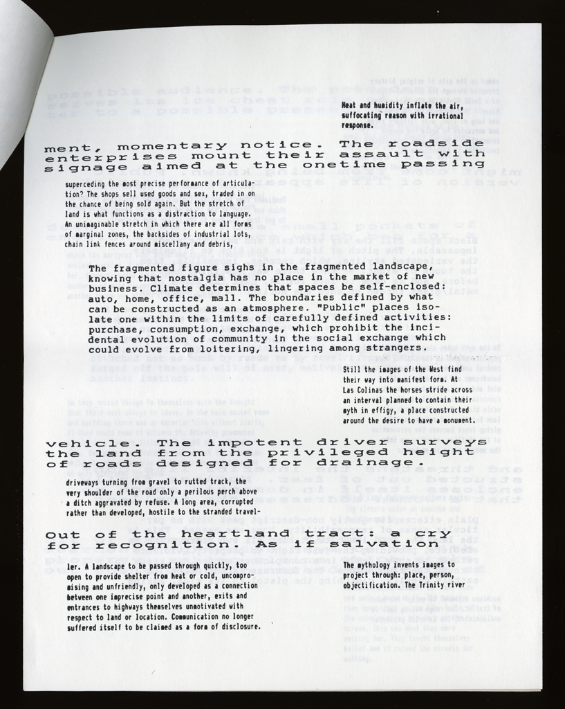
typographic: Dot matrix print-out, in three variable widths.
graphical: The layout stresses the interconnected, intercut nature of the various texts. They move into and out of each other, like roadways or sightlines in a landscape.
The text of this pamphlet is far more compelling than the design or graphic effect. The language of an alienated subject, struggling to reconstitute any locus of self-hood in the distributed, shifting, decentered landscape is poignant and deadly accurate.
Johanna Drucker
type: initiating
role:
author
designer
publisher: Abacus, Potes and Poets Press Inc.
date of publication: 1988-00-00
publisher: A single, uneditioned, unique work, not published.
date of publication: 1988-00-00
publication history: Two editions of this work were produced, this and a deluxe, unique book work. [A. Schutte]
subject: artists' books (LCSH)
themes: The Dallas Landscape and mismatch between that experience and conventional modes of writing.
content form: experimental text (local)
publication tradition: artists' book (local)
related works: My books on Italy (1980), Cuba (2005), and other travel narratives (mainly unpublished, but the Paris Texts (1984-85), and the Italy (2003) text are all works that grapple with the problem of representing the experience of a place through conventions of literary form.
other influences: Samuel Butler's Erewhon.
community: other Poetry communities, though distant, were still vital to my sense of definition of the project and my work.
manuscript type: texts
location: artist's archive
note: Original texts, versions, edits all in existence.
manuscript type: correspondence
location: artist's archive
note: In existence.
manuscript type: mockups
location: artist's archive
note: Paste-ups and tests.
Johanna Drucker
type: initiating
role:
author
designer
Abacus
type: initiating
role:
publisher
printer
location: Elmwood, Connecticut
note: Bookscape was first published as Issue # 33, April 1, 1988, of Abacus.
edition type: editioned
publisher: Abacus, Potes and Poets Press Inc.
place: Elmwood, Connecticut
dates:
publication: 1988-00-00
edition size: Unknown, but not more than 100.
horizontal: 8.5 inches closed
vertical: 11 inches closed
depth: .05 inches closed
production means:
offset (local)
binding: other
substrate:
bookBlock: paper
endsheets: paper
media:
ink (local)
format: pamphlet (AAT)
color: yes
pagination: unpaginated
numbered?: numbered
signed?: unsigned
Johanna Drucker recently received a Mellon Faculty Fellowship for 1988-89 to study avant-garde typography in the Fine Arts Department at Harvard University. Her most recent publications are Through Light and the Alphabet (1986) and Against Fiction (1984). She lives currently in Dallas, Texas, where she teaches at the University of Texas.