


The Word Made Flesh and its immediate predecessor, Through Light and the Alphabet, were both made as distinct formulations in response to theoretical issues in writing and ecriture. Both address the status of materiality in visual presentation of poetic work. Both are direct responses to the work of Jacques Derrida, and also, to the dictates and orthodoxies of many of the California Language Poets whose work and lives had been so intimately bound to mine. The typographic format of the Word Made Flesh was meant to trip the eye, return one constantly to the plane of discourse, of material production. I made this book, and Through Light and the Alphabet, out of complete love of letters. Probably more than any other of my books, these two are absolute celebrations of the beauty and expressive capability of type.
This edition was printed by Johanna Drucker on the letterpress at the Adams House of the Bow and Arrow Press at Harvard University. The printing required three runs: one for the large, black wooden letters, one for the smaller black metal type and one for the red copperplate field.
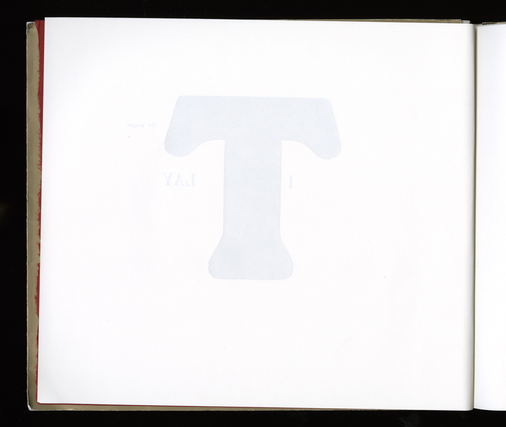
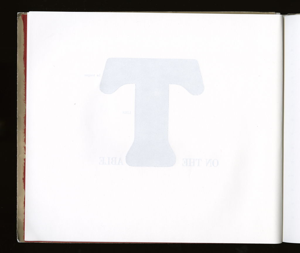
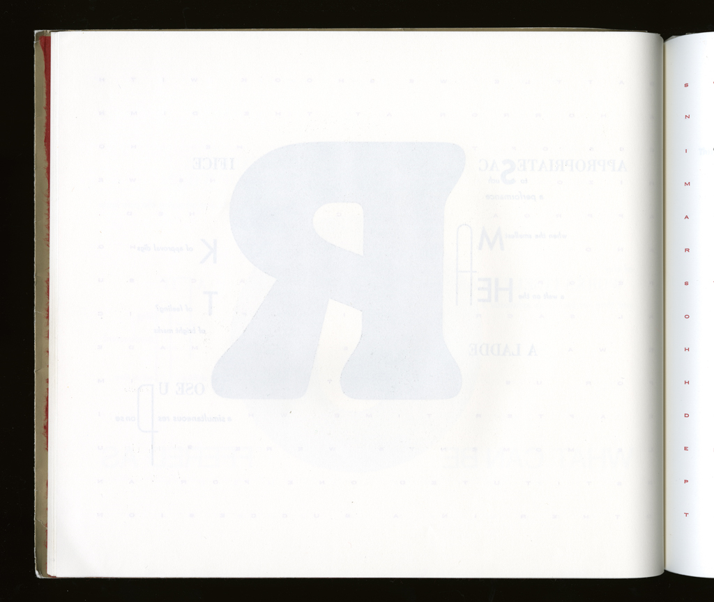
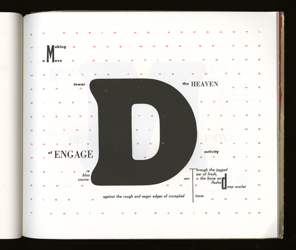
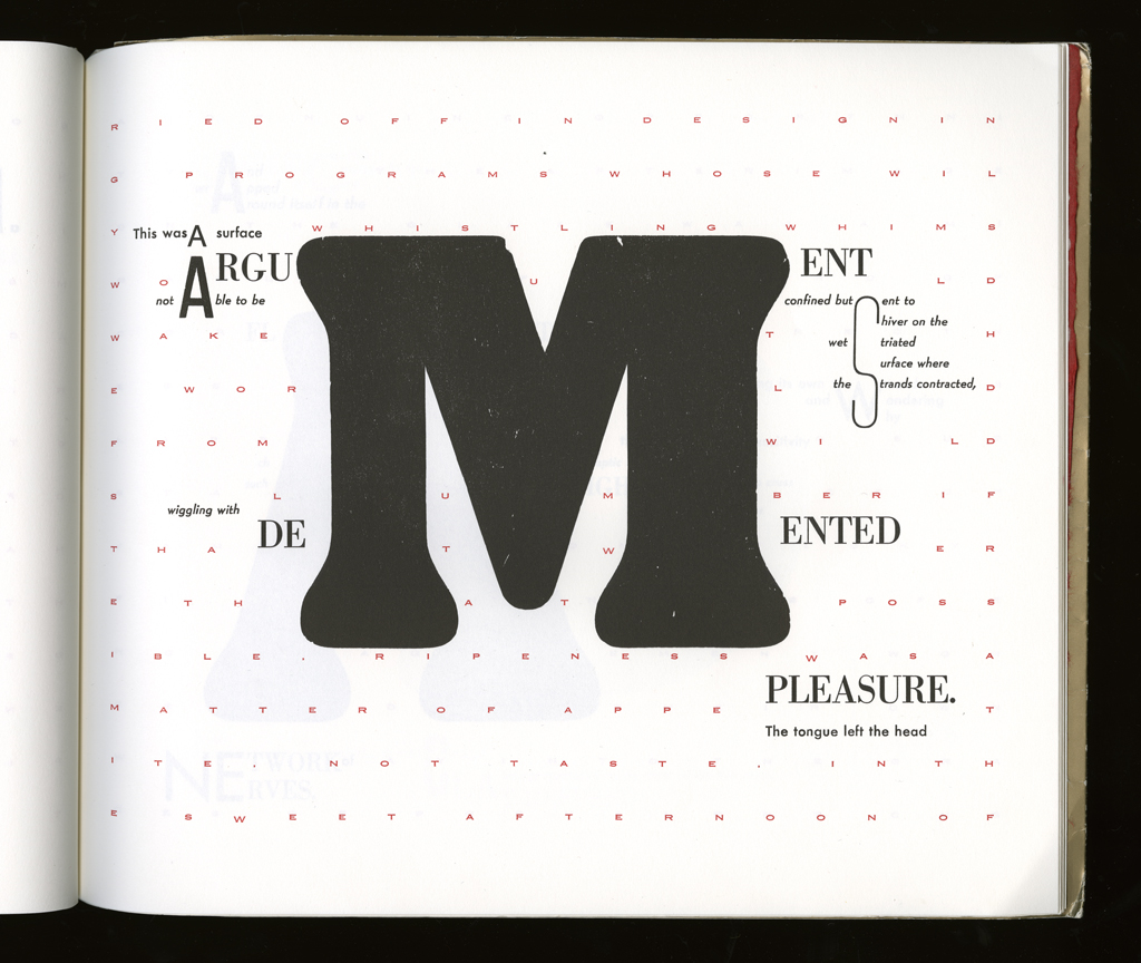
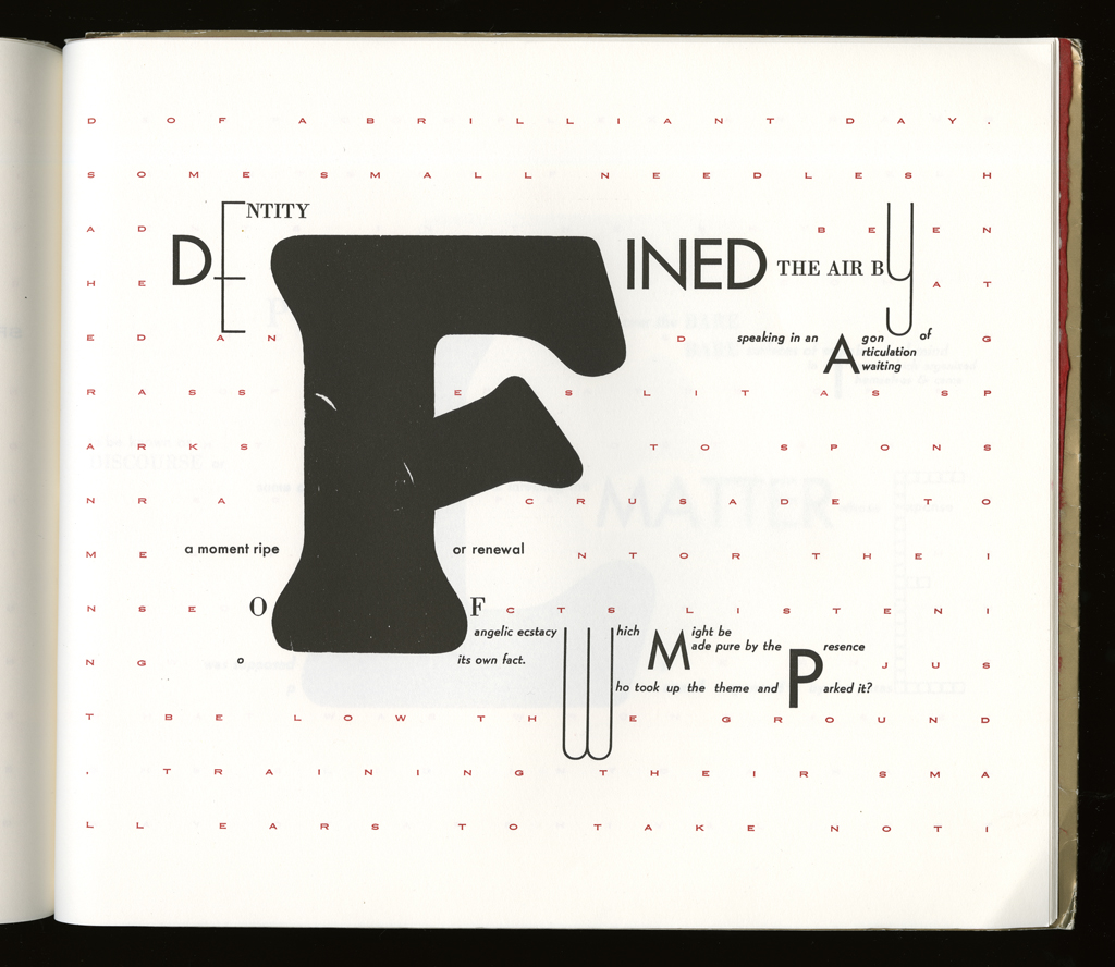
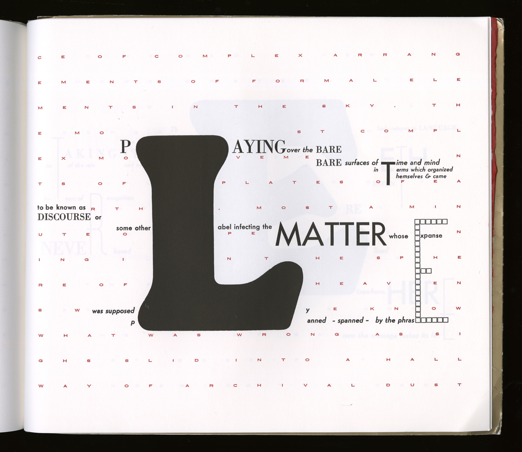
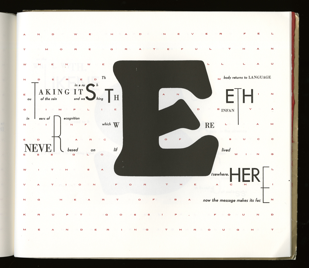
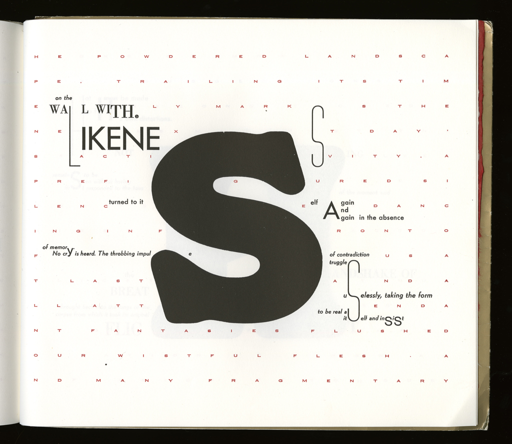
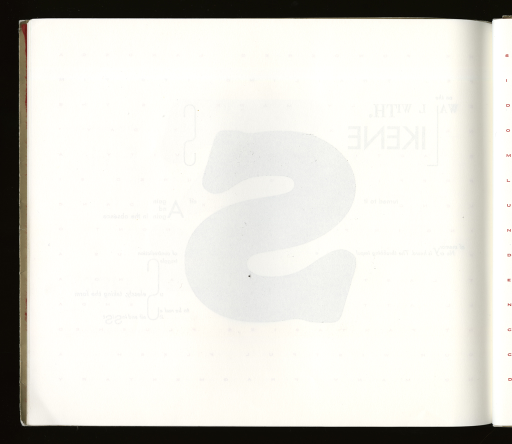
typographic: The book depends on frequent use of paragonnage, the combination of many sizes of type within the same line or even word. The typography creates the word play, locking letters, morphemes, words into multiple syntactic structures. Many faces were used to create contrast of weight and style, but as this was done letterpress, all were locked into upright forms.
graphical: The page design is structured around the large letters that spell out THE WORD MADE FLESH. So each design is distinctive, but the main letterform is generally placed in a central part of the page.
sequence: The title letter sequence determined the length and order of the book.
other features: Originally the cover was to have a "distressed" wound or puncture in it, to further reinforce the religious overtone and heretical character of the book. Seemed too kitschy.
This project worked as a book on the strength of the typographic argument. The theme of word made flesh and the counter theme (written in the red copperplate field) of the flesh made word, are so completely integrated into the presentation, and in such an unequivocal, graphically striking manner, that the theoretical issues are rendered explicitly. No stronger argument for materiality could be made than one that reads and shows this point. By remaining legible, committed to legibility, the work does something that many attempts at calling attention to materiality aren't able to do, since they often sacrifice the textual production for a graphical effect. That the two are intimately bound, in the incarnate word, is shown here. The language is funny, filled with citation and paraphrase of sacred and secular texts, vulgar and crude, literal and allusive, mobile.
The opening sequence is meant as a play on Noam Chomsky's deep structure to surface structure transformations. As if the series of letters were a kernel and the transformations wrought, page to page, are turning it from a deep structure notion to a final syntactically correct statement. A joke, of course, but one that returns to the subtitle: at the interior of language, in the interior of the tongue. Another reference, this to Saussure, in the place between langue ane parole, tongue and speech, here of course obviated by the absence of speech so that language and langue (the system and the tongue) are put into contrast, rather than speech acts and language system. nonetheless, the work is a "speech act" -- that is, it is a "writing act."
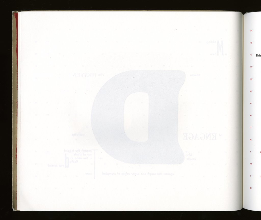
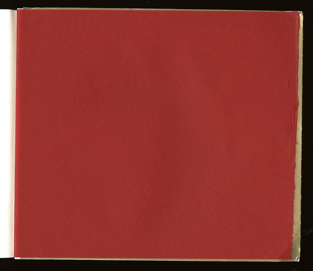
The first page with all the elements present shows the way the illusion of a field and figures work. This is another common theme across several books, in particular Figuring the Word takes this up. But the black texts are meant to "figure" against the red ground, as the images of Christ, a cross, or other devotional images are called out in carmina figurata.
Johanna Drucker
type: initiating
role:
author
publisher
printer
note: The first edition was entirely created by Johanna Drucker and published by Druckwerk [A. Schutte]
Granary Press
type: initiating
role:
publisher
location: 568 Broadway, Suite 403 New York, NY 10012
note: Granary Press published a second edition of The Word Made flesh; it is a facsimile of copy 50 of the original edition with different covers. [A. Schutte]
publisher: Druckwerk
dates:
publication: 1989-00-00
publisher: Granary Books
dates:
publication: 1996-00-00
publication history: There are two editions of the Word Made Flesh. In 1989 Druckwerk published the original letterpress edition. Then, in 1996 Granary Press published a facsimile of the original edition with new letterpress covers by the artist. Both are out of print. [A. Schutte]
movement:
other Language writing, theoretical criticism, feminist theory.
subject:
artists' books (LCSH)
themes: The theme of this book is the materiality of language. Every reference in the book, and all vocabulary, emphasize the idea of embodied language. The impossibility of transcendence, through reference or any hierarchy of truth value or universal meaning, is continually demonstrated by the fact that all references collapse back onto the material of the text and its typographic expression.
content form:
experimental text (local)
publication tradition:
artists' book (local)
inspiration: The writings of Jacques Derrida, devotional visual poetry, particularly carmina figurata.
related works: Through Light and the Alphabet, printed in 1986 before leaving Berkeley, is the companion piece to this book. That work is about the possibility of proliferating meaning and reference through the use of visual, graphic means, which this is about collapsing layers of signification and reference.
other influences: Gino Lee had a strong influence on the planning stages before the project began.
community: press The Bow and Arrow provided a strong community, excellent environment, much camaraderie, not to mention the equipment and opportunity for printing.
note: The two editions of this book are quite similar, but the facsimile has a sturdier binding, and a cover that is more in keeping with the aesthetic tone of the interior pages.
manuscript type: mockups
location: artist's archive
note: The mockups, paper samples, some of the printing trials, etc. are extant.
manuscript type: texts
location: artist's archive
note: The text, and the manuscripts used to make the layout, are in the artist's archive.
Like a number of other book projects designed by this artist, this one was made to work in a wall display so that the W-O-R-D M-A-D-E F-L-E-S-H of the title would be readable.
title note: This appears printed on the title page in an instance of paragonnage: D e/u la (impossible to reproduce here).
edition type: editioned
publisher: Druckwerk
place: Bow and Arrow Press, Harvard University.
dates:
publication: 1989-00-00
note: This edition was printed by Johanna Drucker in December 1988 and January 1989 in an edition of 50 copies. [A. Schutte]
horizontal: 12.6 inches closed
vertical: 10.6 inches closed
depth: .2 inches closed
production means:
letterpress (local)
binding: other riveted, block format
substrate:
bookBlock: paper Mohawk Superfine
endsheets: paper Japanese white tissue and red Moriki end papers
media:
ink (local) black and red ink
other materials: rivets
format: codex (AAT)
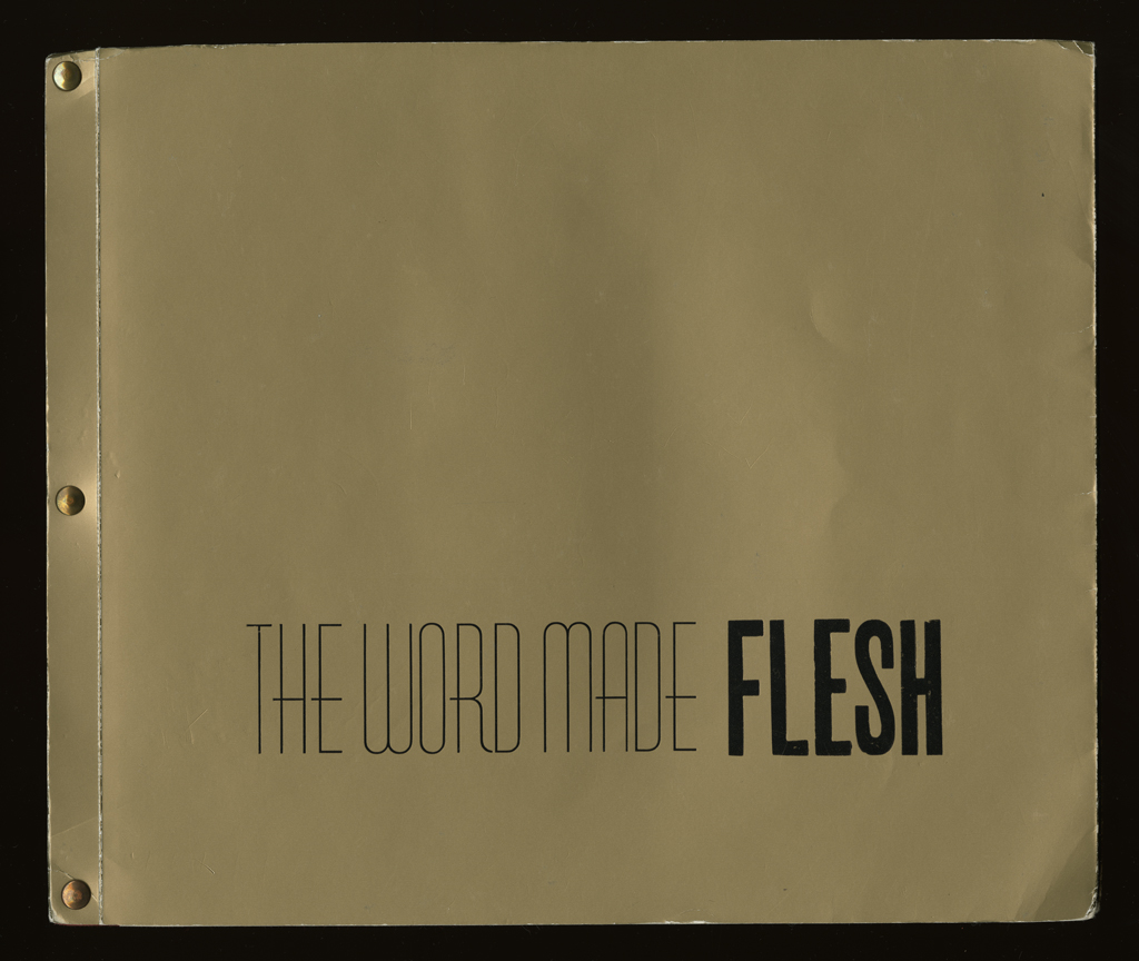
cover: The cover is a thick, metallic bronze paper from Lindemeyer Munroe with inside flaps that fold almost completely back into the binding. The title "The Word made Flesh" appears in all capital letters with The Word Made in Huxley vertical on the bottom of both the front and back covers. The last word: "Flesh" appears in bold and is printed with wood type. On the back cover, "Druckwerk" is printed in all capital letters directly under the title. The edition is bound with three metallic rivets vertically on the left side.
color: yes black and red only
pagination: unpaginated 52 pages
numbered?: numbered
signed?: signed
This book was printed by Johanna Drucker between December 1988 and January 1989 in the sometimes torrid, frequently frigid, basement of Adams House at the Bow and Arrow Press, thanks to the good graces of Gino Lee and Jim Barondess. Special thanks to Gino Lee for all kinds of assistance, to Charles Steele for company, and Philip Walsh for rivetting. The paper is Mohawk Superfine and the type is some of everything linear.
manuscript type: mockups
location: artist's archive
note: Drawings, prep work, mockups.
manuscript type: financial
location: artist's archive
note: All the receipts, etc. are in the tax records and accounts. Some of the records of sales are as well.