


Susan Bee and I had long talked about doing a collaborative work. We share many interests and sensibilities. We had experimented with a dialogue/exchange in the mid-1990s, when I was in New Haven. I printed something on the press and then sent her the sheets and she was going to respond and then return the sheets. This never panned out. I forget if we went beyond one round of exchange or not, thinking that we should do the project when we could be in the same place at the same time. A Girl's Life sprang into being when Steve Clay offered to publish a collaboration between us. The inspiration for the book was what I call the "pink magazines" -- those publications for tweens that produce a discourse of girl culture. I wrote a long narrative based on Ivanhoe (!) since that was very much in mind at the time. Then we tweaked it into a shorter and ever shorter text (Susan helped) until we had just what remains. She did the collages independently, and then we worked on sequencing and design in several visits she paid to Virginia. The work is truly collaborative and the hybrid sensibility produced exactly the look of lost innocence we were after for the project.
The book was produced in Quark and made extensive use of the "follow curve" type tool. We scanned the images to have FPOs in the Quark files, but the final photography was, I think, from the original collages. The typographic design was mine, with Susan advising and consulting. We opted to use system fonts rather than invest in bought faces, partly because of the funky, generic quality of the fonts and their synthetic character. Production went quite smoothly, with only file size as an issue. Also, I didn't have a color printer and so couldn't proof these in color, at least not extensively.
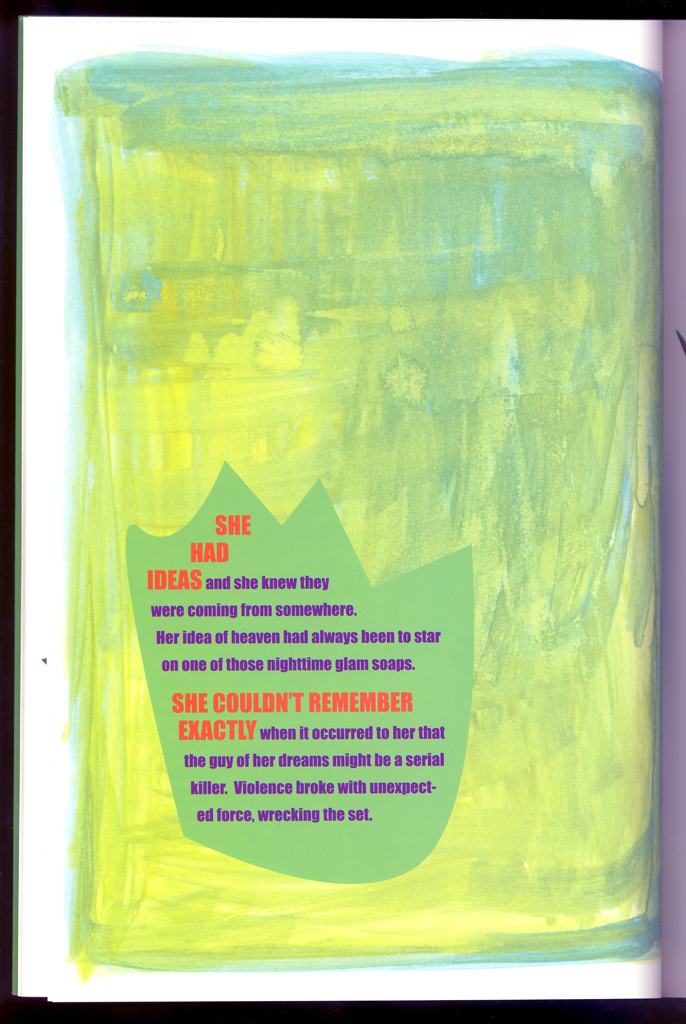
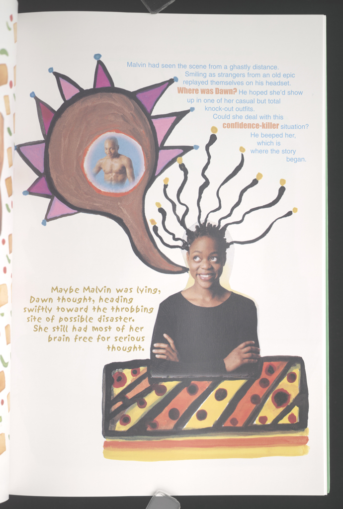
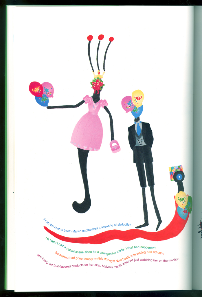
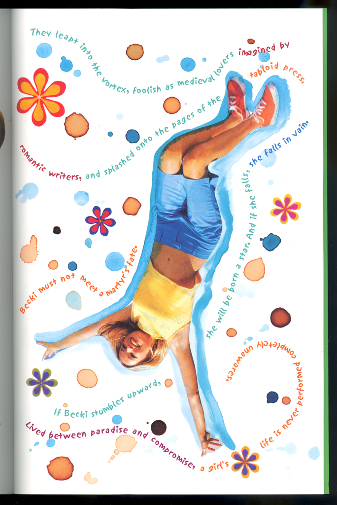
typographic: The type is freeform and does all kinds of tricks on the page, as well as being in color.
imagery: Collages are from pulp and popular sources, mass market magazines, and glossy ads.
graphical: The design definitely references girls' magazines, very colorful and playful seeming in its layout.
openings: Many are savagely funny in the juxtaposition of images.
turnings: The visual impact of each page provides the main impact.
development: There is movement in this book from childhood and innocence to adult devilment, temptation, and a final upward fall.
The act of deforming a popular culture artifact through oblique references marks this book as a serious, ironic, critical piece. The overt playfulness of the text and images, the layout and design, are meant to create a distinct counter-point to the narrative of murder and mayhem. The book is about the impossibility of innocence in current consumer culture, and the sheer difficulty that faces girls trying to have their own experience, let alone live lives, in the face of so much pressure and stimulation from images and media. But it is also a "complicit" work -- one that acknowledges by imitation the extent to which these images (the pink magazines) provide a source of pleasure and fascination. Caught in the space between the critical awareness of the colonizing effects of media and a seductive engagement with its consumable images, the book exemplifies its own argument in graphic, visual, textual forms.
Girls in their teens love this book.
Johanna Drucker
type: initiating
role:
designer
author
Susan Bee
type: initiating
role:
artist
designer
Granary Books
type: other
role:
publisher
location: New York, NY
publisher: Granary Books
dates:
publication: 2002-00-00
publication history: A Girls's Life is a collaboration between Johanna Drucker and Susan Bee published in 2002 by Granary Books. [A. Schutte]
movement:
feminism (AAT)
postmodern (AAT)
subject:
artists' books (LCSH)
themes: girlhood, pop culture [A. Schutte]
content form:
narrative (local)
collage (local)
experimental text (local)
publication tradition:
artists' book (local)
zine (local)
inspiration: Pink magazines
related works: Narratology, History of the/my World, Simulant Portrait -- the "girl" books
other influences: Ivanhoe
community: other Friendship and also the Ivanhoe group at UVa
note: The Ivanhoe references are apparent only to someone who is acquainted with that novel, but Becki is unmistakable.
manuscript type: other
location: artist's archive
note: Many images, notes, and other materials exist.
manuscript type: texts
location: artist's archive
note: The long manuscript and edited versions exist.
manuscript type: mockups
location: artist's archive
note: Trials and alternative layouts, designs, typographic considerations, all exist.
manuscript type: other
location: artist's archive
note: As noted above, many manuscript materials for this edition are extant.
edition type: editioned
publisher: Granary Books
place: New York, NY
dates:
publication: 2002-00-00
edition size: 1500 copies
horizontal: 7 inches closed
vertical: 10 inches closed
depth: .25 inches closed
production means:
offset (local)
binding: mashine sewn (local)
substrate:
bookBlock: paper acid-free
endsheets: paper acid-free
media:
ink (local)
format: codex (AAT)
cover: The front cover, 7" x 10" on the front, is a soft cover that folds in to create front and back flaps. It is brightly colored with a green background, and blue an pink swaths and bubbles of color that contain author and title information on the front, and commentary about the work on the back. On the front cover, two highly made up tweens peer out through a frams of nailpolish streaks.
color: yes
pagination: unpaginated 48 pages
numbered?: unnumbered
signed?: unsigned
A Girl's Life is a collaboration of writing by Johanna Drucker, artwork by Susan Bee, designed by both artists, published by Steve Clay, Granary Books, NYC, in an edition of 1500 copies, in 2002.